Themes
Themes restyle the whole application: the colors of the canvas, the charts and the Licensing globe, and also the shape of the controls, the fonts and the icons.
Choosing a Theme
Open the Appearance settings
Open Settings (Ctrl+, on Windows and Linux, Cmd+, on macOS) and choose Appearance.
Pick a theme
Choose the theme in Settings > Appearance > Theme. System follows the light or dark appearance of the operating system, Light and Dark are the built-in themes, and each enabled extension adds its themes to the list. When a theme family has both a light and a dark theme, such as Copper Night and Copper Day, the list also offers Copper (follow system), which switches between the two as the operating system does.
Check the result
The theme changes right away. The Globe style of the Licensing dashboard is set in the same dialog.
You can also switch theme without opening the settings: run the Appearance command of the theme from the command palette, for example Appearance: Pixel, or click the Settings icon at the bottom of the activity bar and choose a theme in the Themes submenu.
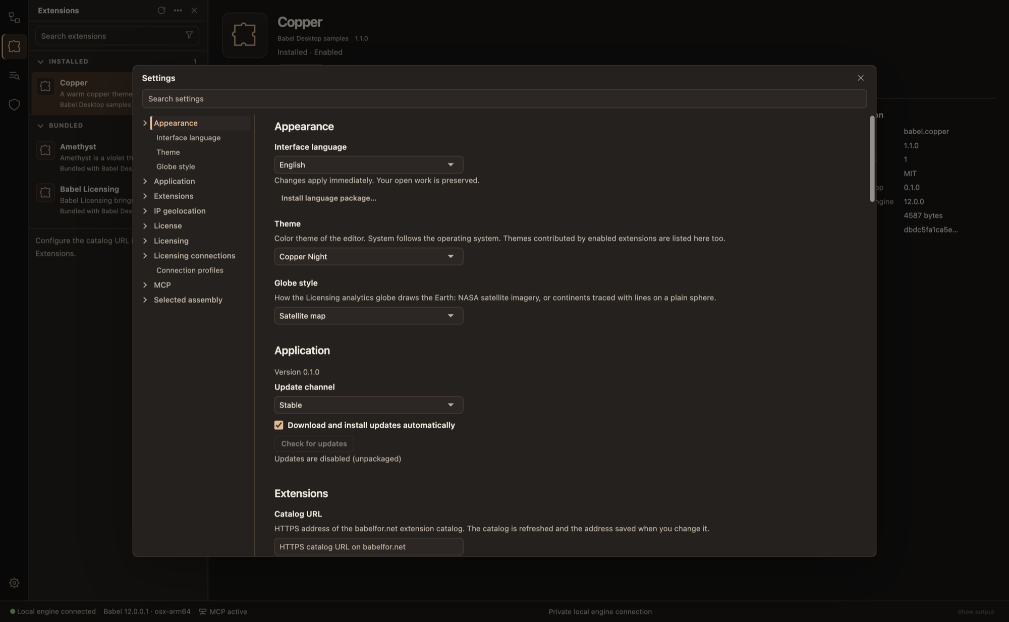
Settings in the Copper Night theme
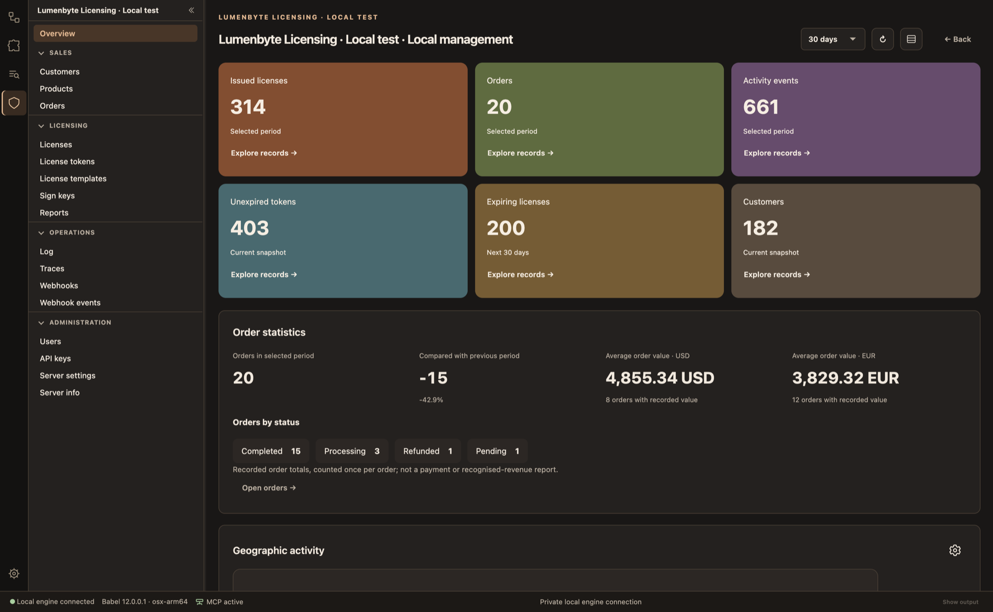
The Licensing dashboard in the Copper Night theme
Density and Text Size
A theme sets how tightly the controls are packed and how large the text is. Density and Text size in Settings > Appearance change the two values for every theme:
| Setting | Values |
|---|---|
| Density | Follow theme, Compact, Normal, Comfortable |
| Text size | Follow theme, Small, Normal, Large |
Follow theme, the default, uses the values of the active theme.
Sample Themes
Babel publishes a set of theme packages as samples. They are listed in the Extensions view; install one and its themes appear in Settings > Appearance > Theme.
| Package | Themes | Look |
|---|---|---|
| Copper | Copper Night, Copper Day | Copper accents on charcoal or on parchment, and a command that opens the XML rules |
| Amethyst | Amethyst Night, Amethyst Day | Amethyst accents on deep plum or on lilac, with its own activity bar icons |
| Parchment | Parchment Day, Parchment Night | Paper and ink: textured surfaces, stamped buttons and hand-drawn icons |
| Pixel | Pixel | Light grey with pixel fonts, pixel-art icons and square controls |
Parchment and Pixel carry pictures and need Babel Desktop 0.3.0 or later. An older version lists them as needing a newer Babel Desktop and does not install them.
Pixel
Pixel is a single light theme, so it does not follow the appearance of the operating system. The package holds no code: it restyles the application with color tokens, shape settings, three font files and SVG pictures.
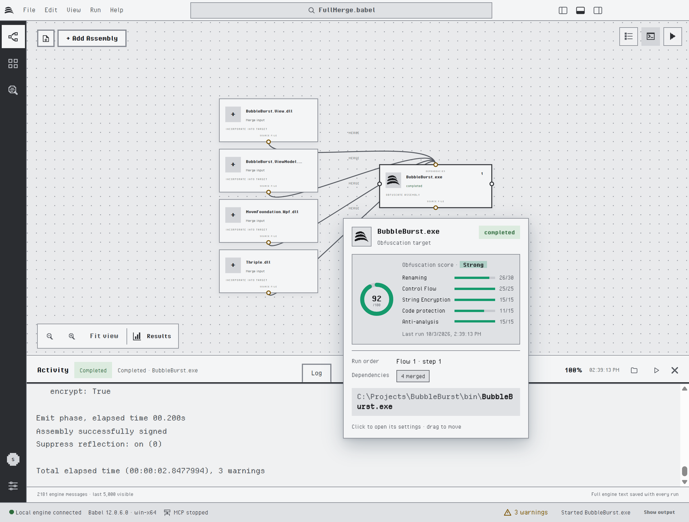
The project canvas and the target card in the Pixel theme
It changes:
- Colors: light grey panels and status bar, with one dark grey for the activity bar, the primary buttons, the active tab and the focus ring. Charts use a grey ramp with two muted hues, steel blue and ochre.
- Fonts: the interface is set in Pixel Operator and monospaced text in Departure Mono. Both fonts are in the package.
- Shape: square corners, thick borders, boxed tabs and outlined fields.
- Icons and logo: the 44 icons of the interface are redrawn as pixel art on a 16 by 16 grid, and the Babel logo is drawn in pixels too.
- Check boxes and radio buttons: a square pixel frame and a stepped circle replace the system controls.
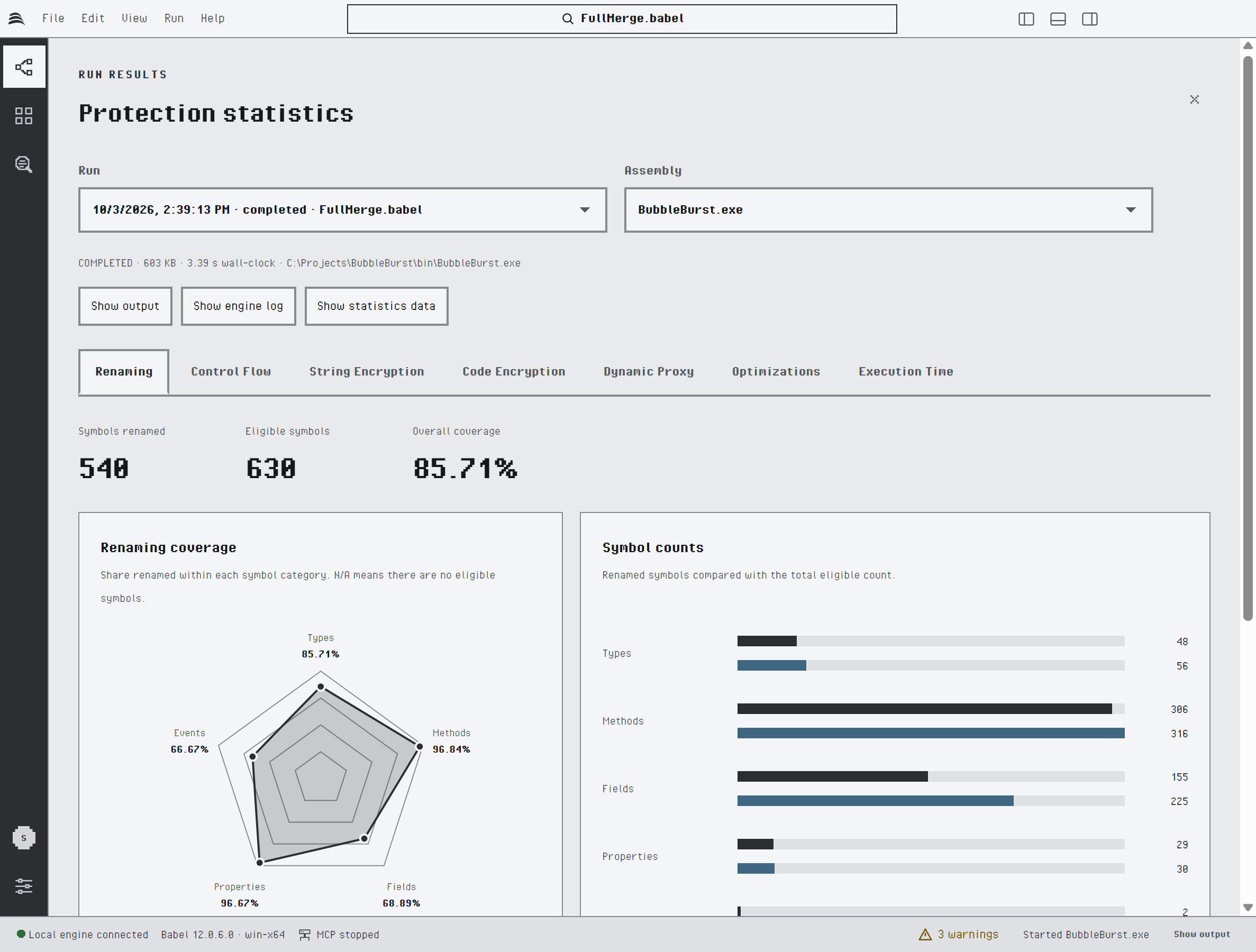
Run results in the Pixel theme
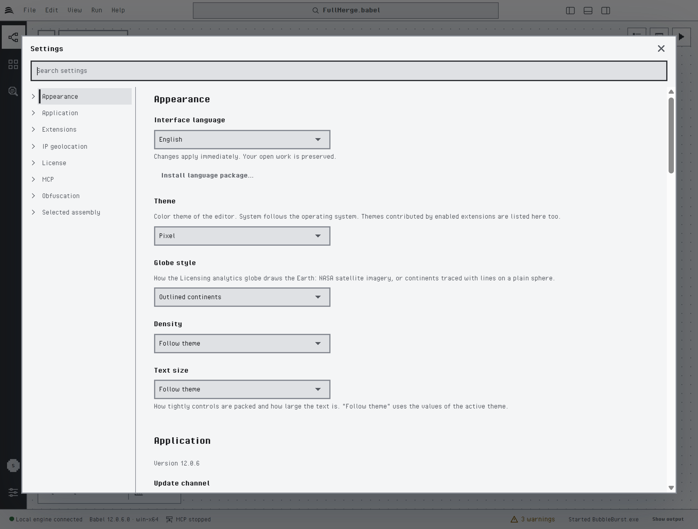
Settings in the Pixel theme
Pixel fonts are drawn on a pixel grid and look sharpest at sizes that are multiples of it. If the text looks soft or small, choose a larger Text size.
Creating a Theme
A theme is a small extension. It starts from the built-in light or dark palette (base) and overrides only the color tokens you list; the rest are inherited. Setting just accent, for example, is enough to recolor buttons, links, selections and globe markers.
Write the manifest
Create an extension.json file that declares one theme or a light and dark theme family:
{
  "apiVersion": 1,
  "id": "acme.teal",
  "name": "Teal",
  "version": "1.0.0",
  "author": "Acme",
  "license": "MIT",
  "description": "A teal theme family for Babel Desktop.",
  "minApp": "0.1.0",
  "minEngine": "12.0.0",
  "permissions": ["themes"],
  "contributes": {
    "themes": [
      {
        "id": "teal-night",
        "name": "Teal Night",
        "base": "dark",
        "family": "Teal",
        "colors": { "accent": "#2cc7b5", "canvas": "#0f1a1c", "activity-bg": "#0b1416" }
      },
      {
        "id": "teal-day",
        "name": "Teal Day",
        "base": "light",
        "family": "Teal",
        "colors": { "accent": "#0f8a7c" }
      }
    ]
  }
}
Follow the manifest rules
idhas the formpublisher.namein lower case, andversion,minAppandminEngineare three-part versions.baseislightordark. Afamilypairs at most one light and one dark theme.colorsaccepts only the documented tokens, each as a six-digit hex value. The tokens cover the base palette (bg,panel,panel-alt,text,muted,line,accent,accent-hover,accent-soft,on-accent,selection,focus,link), the status colors (success,warning,errorand their-bgsurfaces), the canvas, log and status bar, the activity bar, badges, dashboard tiles, chart series and the globe. An unknown token is rejected with the list of valid names.- An optional
iconsobject replaces named icons, such asactivity.settingsorcanvas.run, with simple vector shapes. SVG markup is not accepted here; to use SVG files, add a skin. - A package can also contribute
commandsthat run a built-in action (open-assembly,open-project,save,run,cancel,tab-settings,tab-rules,tab-activity,graph-fit,plugins); this requires thecommandspermission.
Install the theme
Save the manifest as extension.json and install it with Install from file… in the Extensions view.
Package it for distribution
If you want to distribute the theme with a description, pictures and translations, pack it as a .babelext package: a ZIP archive that contains extension.json, a mandatory README.md shown on the Details tab, optional translated README.<locale>.md files, pictures in a media folder and extension translations in a locales folder. The MIT-licensed Babel Desktop Extension SDK provides the manifest schema and the babel-extension command that validates and packs packages.
Increase version whenever you change a theme, then install the new package over the old one.
Shape, Controls and Type
Besides colors, a theme can set shape, controls and type. All three are optional, and a member you leave out keeps its default.
{
  "id": "teal-night",
  "name": "Teal Night",
  "base": "dark",
  "family": "Teal",
  "shape": { "radius": "small", "density": "compact", "border": "thin" },
  "controls": { "button": "outline", "tabs": "boxed", "field": "underline" },
  "type": { "body": "sans", "size": "normal" },
  "colors": { "accent": "#2cc7b5" }
}| Member | Values | Default |
|---|---|---|
shape.radius | none, small, medium, large, round | medium |
shape.density | compact, normal, comfortable | normal |
shape.border | thin, normal, thick | normal |
controls.button | solid, outline, pill | solid |
controls.tabs | underline, pill, boxed | underline |
controls.field | outlined, filled, underline | outlined |
type.body | system, sans, serif, rounded, mono or font:<fontId> | system |
type.mono | mono or font:<fontId> | mono |
type.size | small, normal, large | normal |
The named font families are fonts already installed on the computer; nothing is downloaded. The Density and Text size settings of the user, when they are not on Follow theme, take precedence over shape.density and type.size. A manifest that uses any of these members must declare minApp 0.2.0 or later.
Fonts
A .babelext package can ship its own fonts. Declare them in contributes.fonts and select one with font:<fontId>:
"fonts": [
  { "id": "inter", "family": "Inter", "file": "fonts/Inter-Regular.woff2", "weight": 400, "style": "normal", "license": "OFL-1.1" },
  { "id": "inter-semibold", "family": "Inter", "file": "fonts/Inter-SemiBold.woff2", "weight": 600, "style": "normal", "license": "OFL-1.1" }
]- Font files are WOFF2 files in the
fontsfolder, at most 1 MiB each and 4 MiB in total. licenseis required and must beOFL-1.1,Apache-2.0,MIT,CC0-1.0orUbuntu-1.0.- Every declared file must be in the package and every font file must be declared. Fonts are never loaded from the network, and a bare
extension.jsoncannot declare them. - A family used for
type.bodyneeds a face of weight 600 or more next to the regular one.
Skins
A skin adds pictures to a theme. It has four optional parts:
| Part | Content |
|---|---|
surfaces | Textures behind window, titlebar, activitybar, sidebar, canvas, panel, dialog and statusbar |
controls | Faces for button.primary, button.secondary, button.icon, tab, tab.active and field, and pictures for checkbox and radio |
icons | SVG files for the icon slots |
logo | A PNG or SVG file that restyles the Babel logo on the start screen, in the About dialog and on the primary targets of the canvas |
"skin": {
  "surfaces": { "window": { "image": "skins/paper.png", "layout": "tile" } },
  "controls": { "button.primary": { "image": "skins/stamp.svg", "slice": [10, 12, 10, 12], "ink": "#ffffff", "tone": "#6b3fa0" } },
  "icons": { "canvas.run": { "file": "skins/run.svg" } },
  "logo": { "file": "skins/mark.svg", "mode": "tint" }
}- Pictures sit directly in the
skinsfolder: PNG files up to 512 KiB and 2048 pixels a side, with an optional@2xfile at twice the size, and SVG files up to 64 KiB. The whole folder stays within 4 MiB. - A control face is cut in nine parts by
slice, four whole numbers for top, right, bottom and left, so it stretches without deforming its corners. It also declares the text colorinkand the background colortone, with a contrast of at least 4.5:1. - An icon or a logo with
modetint, the default, is painted in the color the application already uses in that place;colorkeeps the colors of the file. - SVG files are checked before they are used: scripts, styles, external references and entities are refused.
- Every file in the folder must be used and every file named in the manifest must be present. A bare
extension.jsoncannot have a skin. - A manifest with a skin must declare
minApp0.3.0or later. The application icon and the installer cannot be themed.